Graph data obtained from worldvaluessurvey.org
Information Visualisation (Lab 2)
Analysis of happyness and its affecting factors across countries
For the second visualization I have considered computing similarly to the happiness index, two more indexes - income and religious for every country in the world, following the pipeline presented below.
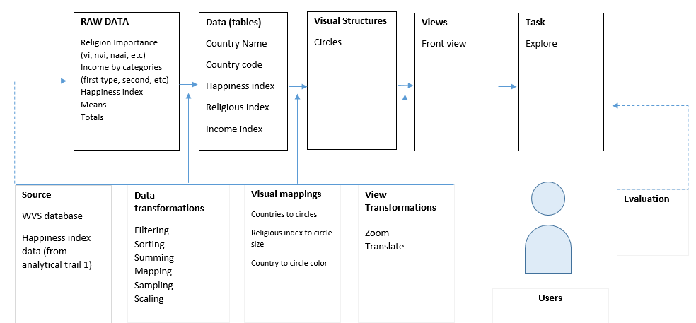
For this data representation I used a scatterplot, on which I plotted the aggregated data about every country. Each country is represented as a circle on the graph.The x axis describes the index of happiness, the y axis stays for the index of income, while the size of the circle represents the religious index of a particular country. The circles have different colors just for differentiation, without having a more sophisticated significance. For exploring the data in more details it is possible to zoom and translate the regions of ineterest, as well as additional detais show up on hovering a specific circle(country).
Happiness index across the world
Although, with a very rough estimate from the obtained results it might be observed a general tendency across the countries, regarding the dependency between the level of income and the index of happiness. With some exceptions, the data shows that indeed the wealthier people are the happier they feel, regardless of general beliefs. In contrast while comparing the dependency of religion and happiness it might be seen that the points are more mixed and spread, which leads to the assumtion that there is no strict dependence between these two variables.
<- Back to Analitical trail 1