Information Visualisation. Project 3
Ambient Visualization of Utilities
The aim of this project work has been to visualize the data about home utilities(electricity, hot water, cold water) consumtion over a period of time.
Based on the source data and the assignment, I have started by contructing the visualization pipeline(Fig.1) for a better understanding of the process and as a reference for the ongoing work.
The innitial data(Raw) contained a variety of values for different time periods and also with a different step. For this particular visualization I have focused on a two months hourly data.
The values for each of the selected utilities was in separate files, therefore I have applied some data transformation by merging it into one structure that could be further used as a source for the visualization(data tables).
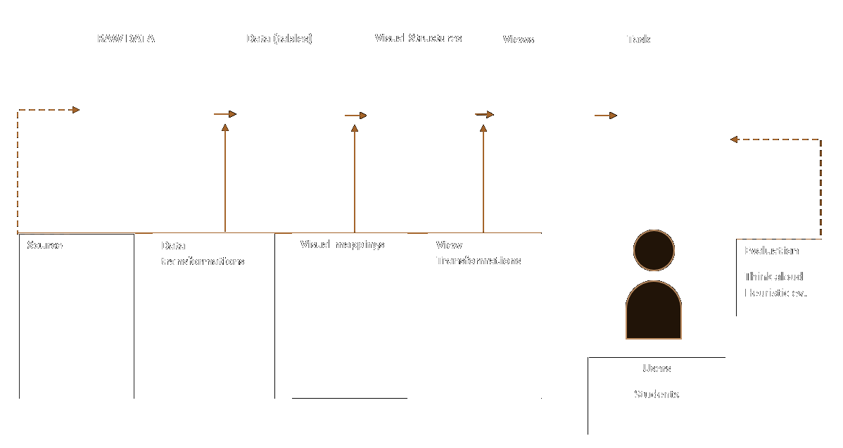 Figure 1. Visualization pipeline
My goal was to visualize the data in a way that will allow comparison between different utilities, however plotting on the same axis values of different types could create confusion. Therefore was needed a way of converting the data to be of the same type. I have chosen to represent the consumed data by the amount of expenses that it actually causes, which would facilitate the comparison between different values. For this I have multiplied the value of each utility to it's most recent cost(in Stockholm.)
The price conversion is as follows
- Electrcity price = 1.2 SEK per kW
- Cold Water price = 18 SEK per kW
- Warm Water price = 48 SEK per kW
The resulting visualization is presented bellow (Figure 2). Each of the utilities expenses are color coded as follows:
- Electrcity expense
- Cold Water expense
- Warm Water expense
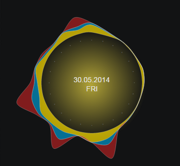 Figure 2. Day overview of utilities expenses by hour
In the center of the chart, is a pulsating gradient that indicated if for this specific day any of the utilities expenses are higher that their corresponsing average values. In Figure 2 for instance the expense of electricity is higher that the average dayly expenditure, so the pulsating gradient is yellowish , which signifies that. In the center of the graph is indicated the current date and week day.
Another purpose of the project has been to create a piece of art that would combine an ambient visualization of information with art, which I have tried to achieve through a minimalistic design and smooth transitions. You can enjoy the result following the link below :-)